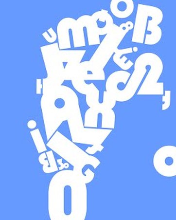
Elements of Design: (building blocks)
1. Line: Lines are the most basic element of design, and they make up pretty much everything. They can also be defined as linear marks that can describe a shape or outline something. You’ll often see that lines are also used to create perspective or evoke a certain feeling. They can be thick or thin, vertical, horizontal, or diagonal, or they can create texture. A straight line can send the feel of order and neatness, while a wavy line can create movement. 2. Shape: We talked above how lines can create shapes, among other things. By reversing this, we can define shapes as something enclosed by lines, which are its boundaries. Shapes can be geometric (rectangle), realistic (animals), or abstract (icons), and they have two dimensions: height and width. 3. Scale: Scale refers to the size of an element in relation to another one, and it can help bring balance, proportion, and hierarchy in any design. Usually, scale is used in design to represent the accurate size of an object or to emphasize the difference in size between two objects. However, if you want to create something that you will make an impact on your audience, then it’s best if you forget about scaling objects according to reality. 4. Space: You’ll often hear people refer to space as white space or negative space, which can be defined as the space between or around objects. If you want to be creative with your designs, you can leverage negative space by manipulating it and forming an object, a shape, or an animal. When you use it strategically, you can genuinely create stunning designs that draw people’s attention. 5. Texture: Texture refers to the surface quality of a design, which can be smooth, rough, glossy, etc. It can be physical or visual. For the purpose of this article, we’ll talk about visual texture. Clean designs are nice and all but adding a little bit of texture can make it pop even more. You can use it to accentuate a specific part of your visual, so you draw people’s attention to the dominant part. 6. Value: The lightness or darkness of color. Value is an important element of design to consider. Especially if the design will be rendered in black & white. Having a range of values from light to dark will produce contrast for the viewer to help discern visual information. 7. Color: Color is one of the most important elements of design because they can evoke certain emotions. It’s well-known that the color red is usually associated with love, passion, or anger. There are also cultural differences that you need to take into account when using colors in design. For example, a color that’s happy in a particular country can send negative emotions in another one. Also, something as simple as changing the hue or the saturation can send a different type of feeling. Color has three different properties:
|
Elements and Principles of Design
All visual design may be reduced to seven visual elements, factors or dimensions. These elements are line, shape, form, space, texture, value, and color. These elements are the building blocks of art structure. They are the alphabet or scale of graphic expression. When an artist organizes these elements he creates form, which is composition. These arrangements are called the Principles of Design. Design is the arrangement of visual information according to aesthetic principles in order to create form, which is the visual carrier of meaning. Principles of Design: (composition)Balance & 1. Alignment: Alignment is the arrangement of elements on a page that keeps them from being a complete disorderly mess. Aligning elements on a page tightens the design and creates a visual connection between them as a whole. In the real world, we use alignment. 2. Emphasis: Emphasis is all about highlighting the most important area in your design. For example, if you want to accentuate the headline in your visual, then make sure to use a font size that will stand out and will draw people’s attention. Similarly, you can utilize a bold color to make the text pop. If you want to make a particular element more prominent, you can use scale to make it bigger or smaller than it is in real life. 3. Movement /Direction: You’ve probably heard before someone explaining a piece of art as having a lot of movement. Even though a visual is static, it can still give the feeling as if the design is actually moving. For movement, you can use shapes, lines, edges, or color, the purpose being to direct the human eye. When designing something, you can take advantage of certain elements to control how the human eye travels over a design. 4. Pattern: Pattern is the repeating of an object or symbol all over the work of art. Repetition works with pattern to make the work of art seem active. The repetition of elements of design creates unity within the work of art. 5. Proportion Proportion is the relationship between two or more elements with respect to size, colour, quantity, degree, setting, and other aspects. Proportion is ratio or scale. The relationship is said to be harmonious when a visually pleasing or desirable ratio is evident among the elements. 6. Rhythm: The same way spaces between musical notes create rhythm, spaces between design elements can give rhythm as well to a visual. Visual rhythms can be regular, flowing, progressive, random, and alternating. 7. Unity: Unity is all about how the different elements of your design come together and form a relationship. You’ve most likely seen before designs that give you the impression that the fonts and everything else were chosen at random, so there wasn’t any sense of unity. All the visual elements you use in your design should be connected to one another. Also, unity is going to help you communicate your message in a clear, organized, and concise manner. 8. Variety: Variety is the principle of art that adds interest to an artwork. Variety works through juxtaposition and contrast. When an artist places different visual elements next to one another, he/she is using variety. Straight lines next to curvy lines add variety. Organic shapes among geometric shapes add variety. |
